S’il est très facile de changer l’apparence des champs de formulaire text et submit via le css, en revanche changer l’apparence des Checkbox n’est pas une chose aisée et pourtant comme on va le montrer dans la suite de cet article un peu de bidouillage et l’affaire est dans le sac.
Au départ nous avons quelque chose qui ressemble à ça :
<label for="checkbox" class="checkbox" >
	<input type="checkbox" name="validate" id="checkbox" >
	Cochez moi cette case !
</label>

Procédons maintenant aux changements suivants :
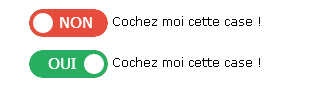
<label for="checkbox" class="checkbox" >

			<span class="checkbox-change">
				<input type="checkbox" name="validate" id="checkbox" >
				<span class="checkbox-change-content">
					<span class="on">OUI</span>
					<span class="interm"></span>
					<span class="off">NON</span>
				</span>
			</span>
			 Cochez moi cette case !
		</label>
Au niveau du CSS on aura :
#checkbox { display: none;}

.checkbox-change {
	display: inline-block;
	vertical-align: middle;
	margin-left: -10px;
	width: 79px;
	height: 28px;
	overflow: hidden;
	border-radius: 20px;
	-webkit-mask: url('data:image/png;base64,iVBORw0KGgoAAAANSUhEUgAAAE8AAAAcCAYAAAAgLuLfAAAAGXRFWHRTb2Z0d2FyZQBBZG9iZSBJbWFnZVJlYWR5ccllPAAAAU9JREFUeNrsmj1rwlAUhm8UhIKrk+DQ3S5CoKsgCAFB6No/4X/q7A8QoeBcBMUhSwaXgMFJUNKlPaeeFlPyce8Z4/vCE7JkuA/n5ubcG2Oq0yamxBsREV81JpJxTmXc6rSIGXGsubAijjL+lqu4wR1UmUs1+rbiXogzpGU4i5fSTCCqlEmRuD5xgqBSTuIpkyaxhhwr1uLrL6+Q4gT7Mp5Y5BWlZxDb7InHBl2GEOcc9jVkeWO4UCVgec/woIrP77wD0YEL5yQsL9X0b4j5bMCBPiwvgQbdtGV5ITyoErK8BTyosvCk0d3AhXOefm826FedyBRbACFOBP/L8B1SrFjlzeEuEUNOKbF4yu/XDM4vikiNxUGQjwrMrTjrEzTer1pC2g9L7X4nryq7O5W2y1tVb+NZSuQPaf4FYUQ8mOuheN3yQVyk45oT26oHvgUYAKpYc6Yexp0QAAAAAElFTkSuQmCC'); /* nécessaire pour Webkit pour ne pas avoir de bordure*/
}
.checkbox-change-content {
	display: inline-block;
	width: 130px;
	height: 28px;
	margin-left: -51px;

	-webkit-transition-duration : 0.5s;
	-moz-transition-duration : 0.5s;
	-ms-transition-duration : 0.5s;
	transition-duration: 0.5s;
}

.on,  .off {
	display: inline-block;
	float: left;
	background-color: #1fb307;
	width: 50%;
	height: 20px;
	padding: 4px 0;
	text-align: center;
	color: #fff;
	font-size: 15px;
	position: relative;
	z-index: 1;
}

.on { border-radius: 30px 0 0 30px;}

.off {
	background-color: #c90000;
	border-radius: 0 30px 30px 0;
}

.interm {
	display: inline-block;
	float: left;
	width: 20px;
	height: 20px;
	border-radius: 30px;
	background-color: #fff;
	margin-left: -14px;
	margin-right: -14px;
	position: relative;
	z-index: 2;
	border:  4px solid #c90000;
	-webkit-transition-duration : 0.5s;
	-moz-transition-duration : 0.5s;
	-ms-transition-duration : 0.5s;
	transition-duration: 0.5s;
}

input:checked + .checkbox-change-content { margin: 0;}
input:checked + .checkbox-change-content .interm { border-color: #1fb307;}
Et le résultat final donnera :
Vous pouvez voir la démonstration en ligne : DEMO